Being visual creatures, humans are reliant on sight as a facilitator for decision making. Entire industries are built on providing visually appealing products, sometimes at the expense of utility. We all have a friend with an eccentric furniture collection, who favors form over function.
This is one of the reasons that product images are at odds with the rest of the conversion optimization mindset. For pretty much everything else, we worry about function over form. We want intuitive websites that are easy to use. We want clear and straightforward messaging. We work diligently to remove elements on the page that do not contribute to increased conversion activity — paring down to the bare minimum content that will support a sale.
Product image optimization provides stark contrast to this mindset. With image optimization, we’re primarily concerned about offering as many images as we can. We want them to be as large as possible. We try to provide every last possible detail that the camera can capture. We’ll even feature the same details in multiple ways, leveraging Photoshop to enhance and enlarge areas, adding callouts, and overlaying text. We’ll even relinquish ultimate control and allow users to upload their own images.
Having great product photography is do-able.
Great product photos can be expensive. For most companies, it’s difficult to do them in house. Aside from the expense of building a small studio, it’s often not the best use of your time. Maybe you’re lucky and you have a photographer or two on staff. I love photography, but I still don’t take my own product shots.
For those with large quantities of SKUs, it’s probably impossible to apply this level of attention across a whole catalog. I would recommend starting with your best selling products and work your way down.
Of course product pages aren’t the only place where product images are in use — they have several types of utility. Often, users rely on images for navigational purposes. A common “user story” goes something like this:
- User arrives on the homepage by clicking an ad (an image).
- User clicks on an interesting category (another image).
- From that category page, user scans all images and selects the one that catches their eye (/another/ image).
- At this point, the user first looks at the image on the product page. Ideally it’s a larger version of the one they just clicked on. The intent was to “see it bigger” and inspect the product.
- If they like what they see, they’ll probably look for additional views/angles and flip through the rest of the images. If they do not like what they see, they’ll go back and comb through the images on the category page again.
How many images do you need?
Let’s think about this one critically. Say that you’re selling a simple box for storage. In three dimensional space there are six faces to that box:
- Left side
- Right side
- Front
- Back
- Top
- Bottom
If the box has a pattern on it, you’ll want to show all six sides just to allow the customer to complete a bare-minimum visual inspection.
If the box opens, or has a lid, you might need more.
The rule of thumb that I use is:
- How ever many images is necessary for a full visual inspection (all sides, angles, etc.).
- 1 or 2 lifestyle images that prominently feature the product in use.
- Any other images required for users to understand scale, color variation, weight, fit, or utility.
I rarely create or advocate for product pages with less than 7-8 images. I just can’t make sure users have what they need with fewer than that.
Before you try to utilize one of those fancy 360 degree views, I have seen hundreds of users arrive at pages featuring these prominently. The vast majority of users treat them as regular images and don’t engage with the rotation functionality.
What should the images show?
Your customers use images for these primary reasons:
- To see how a product looks, visually
- What does it look like?
- What is it?
- How do the variants compare? (Color, size, etc.)
- What might I look like using this?
- To ascertain scale.
- How big is it?
- How much does it weigh?
- What are the dimensions? (Doubly true for certain features of a product, such as the opening of a container, or size of the keyboard on a laptop.)
- To understand utility.
- How does it work?
- What are the core features and functionality?
You have two primary types of images: those that feature the product, and lifestyle shots.
Images that feature the product are great for communicating answers to many of the above questions. Typically they’re on a white background, but it’s become a trend to include site / brand colors in the background. This allows you to use the product images around the site, which contributes to the overall look and feel.
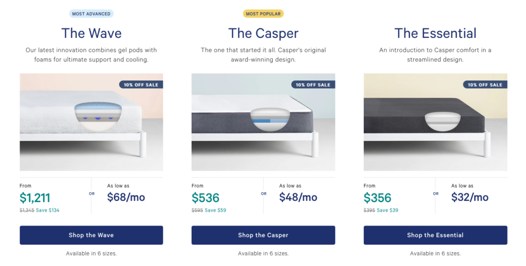
Casper does a fantastic job of this (see below). They could have gone with a plain background on the mattresses, but they chose to use background colors, and place them on a bed frame. Note that this image is taken from a comparison page (or “view all” page) rather than a product page itself.
For the other type, *lifestyle images,* you’ll typically feature people, or animals, or use a realistic setting. The trick is to avoid looking like a JCPenney or Sears catalog. If it looks like it was taken in a studio, you’re probably missing the mark.
The most effective product shots are those that emphasize the person, animal, or location that is engaging with the product. Keep your product-only shots featured on the product, and make them secondary and “natural” to your lifestyle shots. They’ll feel more organic, inspirational, and your customers will like them more.
Here is the first image in the carousel from Casper on a product page (accessed via one of the images above):
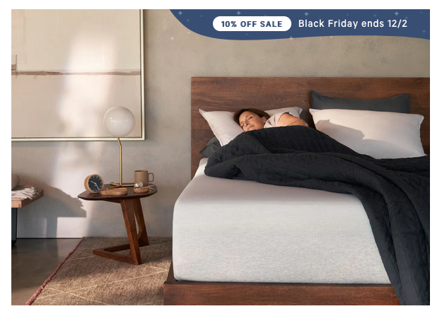
Note that this image is different from the previous one. Context is key, of course. The previous image does a great job of helping you compare the different versions available and encourages clicks to the product page. That’s its job. This one, though, is a well done lifestyle image. This looks quite natural to me. The model looks “real,” it doesn’t look like a studio glamour shot, and the mattress (the actual product), isn’t the core focus. Well done.
The above information, if followed, puts you in the top 1% or so of websites that I’ve seen. The rest of the minutiae is for another time, another day, when the rest of the low hanging fruit has been plucked.