
I break conversion optimization into two parts:
- Pre-checkout: meant to deliver important information at the proper time in order to encourage a conversion event.
- Checkout: where the rubber meets the road, the actual intended action.
You can do all of the work in the world to make sure that your pre-checkout information (homepage, product pages, marketing collateral, etc) is absolutely outstanding, yet still, you’ll often suffer from poorer results than your site is capable of.
Checkout optimization is very different from typical page (i.e. information) optimization. You’re no longer trying to inject new information into the flow, you’re trying to minimize friction and overcome latent trust issues with shopping online. You’re also trying to deliver on and reinforce the promises you made previously in the browsing session.
In many ways, much of this work is aimed towards new customers — but it benefits existing, repeat customers as well.
We will begin with a brief overview of the key metrics and issues that you’ll face when optimizing carts and checkout.
Cart Abandonment
Some portion, perhaps a large portion, of your website visitors will add something to their cart, or will visit the checkout page, and not complete their purchase. Cart abandonment typically sits around 65-70%. Let’s take a minute to really unpack that number.
A typical site has an add to cart rate somewhere between 3 and 7%.
Let’s assume your site is smack-dab in the middle at 5%. That means that for every 100 visitors , only 5 of them add something to the cart. Alternatively, we could say that 95 people out of 100 do NOT add anything to their cart.
So, now that 5/100 visitors completed the first task in the checkout funnel, how many will actually make it through? Probably not more than 1 out of 3.
In simple terms, for every 300 people that go to your website, 15 will add a product to the cart, and 5 will complete their purchase. That’s pretty depressing.
When you ask users why they abandoned their cart, they’ll often tell you one of three stories:
- Users were browsing without commercial intent.
- Users had commercial intent, but planned to come back at a later date.
- Users had sticker shock and were surprised by shipping / handling / other charges.
The bad news is that none of these things have anything to do with design, or UI/UX. You can’t do a lot about it.
What can you control? What can you optimize? Based on my experience, these are the strongest potential areas for improvement:
Guest Checkout
Many ecommerce platforms have features that enable customers to register an account. It makes sense — it’s a great way to present the user with self-serve information about previous and current orders, and it allows you to have billing/shipping information on file to reduce friction on future purchases.
The problem is that pushing for a registration is almost a conversion event in and of itself. If you’ve read the other issues, you should know by now that I’m not a fan of injecting side quests into a conversion path.
If you really want to get users to register an account, take a page from the Shopify playbook. Shopify allows you to check out as guest and then create an account after the purchase is complete, simply by providing a password.
Trust Issues
This one is all about perception. Most users will not crack open the “view source” feature of their web browser and evaluate your site security. Instead, they rely on several trust elements to make them feel safe.
These are things like:
- Having a valid SSL certificate
- Credit card logos (yes, people derive trust from these)
- Customer service options (a phone number and live chat is great)
- Return policy information (at least a link to it, but be careful not to hijack the session — open it in a modal or popup)
- A physical address
- Security seals (Norton, Verisign, etc)
If you have to pare down this list, I’d recommend at the very least having these:
- Having a valid SSL certificate
- Credit card logos (yes, people derive trust from these)
- Customer service options (a phone number and live chat is great)
- Return policy information (at least a link to it, but be careful not to hijack the session — open it in a modal or popup)
Hiding the Price
The golden rule of checkout is “thou shalt not have any surprises.”
You should make every attempt to display an accurate price total that represents the current status. This means that you should display a total that includes shipping or other costs as soon as they are known. If you offer flat rate shipping (or free shipping) you know a lot sooner (and can show users a lot sooner) than if you were offering calculated shipping.
If your site is configured to redirect users to the cart after each click of “add-to-cart,” you should be showing the full total. Doing anything else makes users feel like you’re altering the deal and some users go as far as describing this as “being taken advantage of.”
Be less like Ticketmaster and more like Amazon.
Shipping Woes
There are two primary reasons that shipping kills conversions.
1. It’s too expensive.
People hate paying for shipping. I’ve seen literally hundreds of users remark about shipping costs. Anything over $7 and you’re getting “whoa, that’s pretty high.”
Anything over $0 and you’re getting “I wish they offered free shipping.”
I know, I know. A lot of you use the “add more products for free shipping” pattern. This is effective at getting higher tickets, but I haven’t seen any definitive, significant testing that fits most sites with respect to conversion activity alone. It’s something to test out.
2. It’s too slow.
There are about 5,000 reasons why users want things quickly, but suffice to say, as a general rule, they want them quickly. If your checkout page says it takes 5-7 days for delivery, the first thing that a user thinks is “that’s like 3x slower than Amazon.” So off to Amazon they go.
Please don’t avoid displaying shipping dates if you ship slowly. Customers still want to be able to see this. It feels dishonest to hide the date because you think it will turn off your customers, and I think slow shipping makes it even more important to set expectations upfront. They’ll find out anyway (and probably be more angry for it).
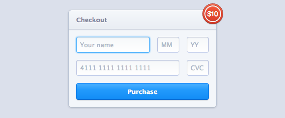
Optimize the Form
There are dozens of best practices when it comes to optimizing forms, and I’ll be doing a full issue on this soon.
A lot of complexity arises from having multiple device targets — mobile, tablet, and desktop. Users interact with forms quite differently depending on what form factor they’re currently using.
Mobile devices, for example, typically will capitalize letters for them, and it can be important to make sure to pop open the correct keyboard (yes, there are multiple on smartphones). If you have a telephone number input box, you want to pop open the number pad, not the alpha keyboard.
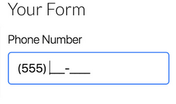
Also worth noting is that you should provide design cues as to the format of information that you are looking for. Something like this is a good example of using placeholders:
This is a good example of using input masks:
Multi-step Checkout Flows
Many sites implement multi-step checkout flows. Over the past few years we’ve seen them get longer, and longer. Having 5 or 6 steps in your checkout flow is actually pretty typical in 2019.
Not all multi-step checkout flows have to be separate pages. Many of these are accordion style checkouts that all appear on the same page.
Should you implement a multi-step checkout? It’s difficult to make a recommendation. I have seen sites benefit greatly by consolidating into a single page, and I have also seen other sites benefit greatly from breaking up the flow into chunks and steps. It really is something that you absolutely have to test for yourself.
I would say though, that you should consider the context. If you sell a digital item, do you really need to collect anything other than an email address? If you have non-required fields on your checkout, do they get utilized? Are they really that important? Consider this carefully and pare down what you can.