If you abstract out and take a look, you’ll see that there are really just two colors in this content section: black text and a white background. I’ve also played a little with bolding and increasing the font size of the headlines. There are no buttons, no accordion menus, no add to cart or checkout functionality — it’s a pretty simple piece of content from a utility standpoint.
If you’re reading this, I’m going to go ahead and guess that you’re reading it linearly. That is, from top to bottom. Maybe you scanned the headlines first before diving in. That’s pretty typical brain stuff.
Go with the (brain)flow.
A lot of CRO (conversion rate optimization, of course) is based on our understanding of how the brain works. The best CRO projects are those that try to go with the flow and help the brain do what it wants to do, without asking too much in return. Bad CRO projects work against the brain’s natural tendencies, trying to get people to do something that requires willpower and intense focus.
What’s relevant to today’s topic is the idea of visual hierarchy. Establishing visual hierarchy helps us communicate the importance of information at a glance.
Size, location, and color dominance.
When it comes to hierarchy, you have three tools at your disposal.
Size
By default, the brain views larger text as more important. Small text is easier to discard with a glance or skim for bolded sections.
Stick to a handful of sizes and don’t stray. It’s ok to have a few levels of headings. That’s good for SEO, and it’s good for reading too. Size is one of the most intuitive ways to establish relative importance. Make sure that your sizes are congruent with the significance of the content they represent.
There’s something called the rule of target size, and the idea is that the size of something, say a button, should be proportional to its expected frequency of use. Something that is used more often should probably be bigger than something used less often, especially if they’re in close proximity. It seems intuitive and basic, but I’m pretty sure we’ve all violated this at some point.
I recently saw an example of an e-commerce store that had a big box of add on items above the add to cart button. When asked, they produced stats that showed only 24% of visitors added any add-on items to their cart. To me, that says that section, which took up approximately 30% of above the fold real estate, was a complete waste of space for 76% of users. I recommended downsizing that element substantially and focusing on the most popular add-on item. Not only did sales of that add-on item increase, the conversion rate of the page increased a healthy amount, too.
Location
Content that users encounter first typically gets read more often. Use this to your advantage. The higher up something is on the page, the more important it appears, and the more likely it is to be read or engaged with.
This is one of the reasons that the ‘above the fold’ content is the first place I look to optimize. It’s also one of the reasons that a lot of sites fail to convert — they cram everything they can think of into the above the fold section in hopes that it helps with conversions. As I’ve said before, stop thinking about what you can add to make more sales, and think about what you can remove. I’m pretty firm in my belief that if you begin with a good page and remove 10-20% of the content, you’ll end up with a great page. In the literary world writers and editors say this all of the time, and it applies to websites too :)
Aside from top and bottom, we’ve also got proximity.
This is one of those sneaky tips that people never seem to consider. The brain views things that are close together as related and of the same group. Take a look at your pages and make sure that your implied groupings make sense.
I like to scroll down and stop every few hundred pixels and evaluate everything I can see on the screen. I also like to mark transitions with changes in background color or layout (such as using an alternating two-column layout with images in one column and text in the other).
Color Dominance
A great many websites are guilty of using color to compete for attention. Browse around a bit, and you’ll regularly see important pages (by the site’s standards) that have 8, 10, even 12 colors on them.
When you look at these sites, ask yourself: “Which color is the most important?”
It’s often difficult to tell.
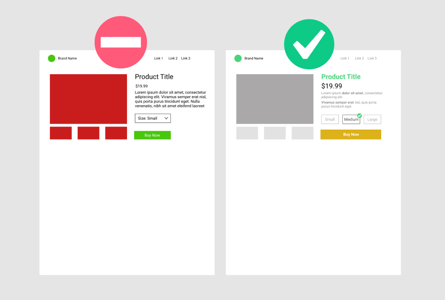
Pages that convert well isolate the calls to action, and important bits from other content. This is the proper way to use color.
I typically recommend four colors:
- The brand color, seen in the logo.
- Black (or the brand color) to emphasize headlines.
- A darker shade of grey, for the second-tier copy.
- A contrast color (generally on the other side of the color wheel from the brand color) for CTAs.
I took a few minutes and made a mockup showing a before and after of this idea on a typical ecommerce product page:
If everything is important, nothing is.
If I had to put a cap on this, I’d say that if everything is important, then nothing is. The goal is to look at a page and be able to discern immediately which information is important and essential, and which information is supplemental. Take a hard look at your pages and see if you can help users arrive at those judgments as quickly as possible.
Resources and Case Studies
Here’s a nice post that links to a few studies for further reading and has a lot of good examples on the use of color, through a conversion rate optimization lens.
The Impact of Color on Conversion Rates | Adobe Blog
For the more technical reader, here’s the spec from W3 on Use of Color (and how to provide visual contrast without color):
Understanding Success Criterion 1.4.1 | Understanding WCAG 2.0
Color is an important asset in design of Web content, enhancing its aesthetic appeal, its usability, and its accessibility. However, some users have difficulty perceiving color. People with partial sight often experience limited color vision, and many older users do not see color well. In addition, people using text-only, limited-color or monochrome displays and browsers will be unable to access information that is presented only in color.
Examples of information conveyed by color differences: “required fields are red”, “error is shown in red”, and “Mary’s sales are in red, Tom’s are in blue”. Examples of indications of an action include: using color to indicate that a link will open in a new window or that a database entry has been updated successfully. An example of prompting a response would be: using highlighting on form fields to indicate that a required field had been left blank.
Here’s an old classic from Slate on how people read online. Highly recommended :)
How people read online: Why you won’t finish this article.
It begins like this:
I’m going to keep this brief, because you’re not going to stick around for long. I’ve already lost a bunch of you. For every 161 people who landed on this page, about 61 of you—38 percent—are already gone. You “bounced” in Web traffic jargon, meaning you spent no time “engaging” with this page at all.
So now there are 100 of you left. Nice round number. But not for long! We’re at the point in the page where you have to scroll to see more. Of the 100 of you who didn’t bounce, five are never going to scroll. Bye! OK, fine, good riddance. So we’re 95 now.
Here’s another of my favorite resources, which probably doesn’t need an introduction, as the title is pretty much exactly what you get.
The Web Credibility Project: Guidelines - Stanford University